Advanced plots
The Advanced Plots tool visualizes multiple genes at once from a clustered Seurat object. It can use an uploaded RDS file, the current Single Sample object, or the current Integration object.
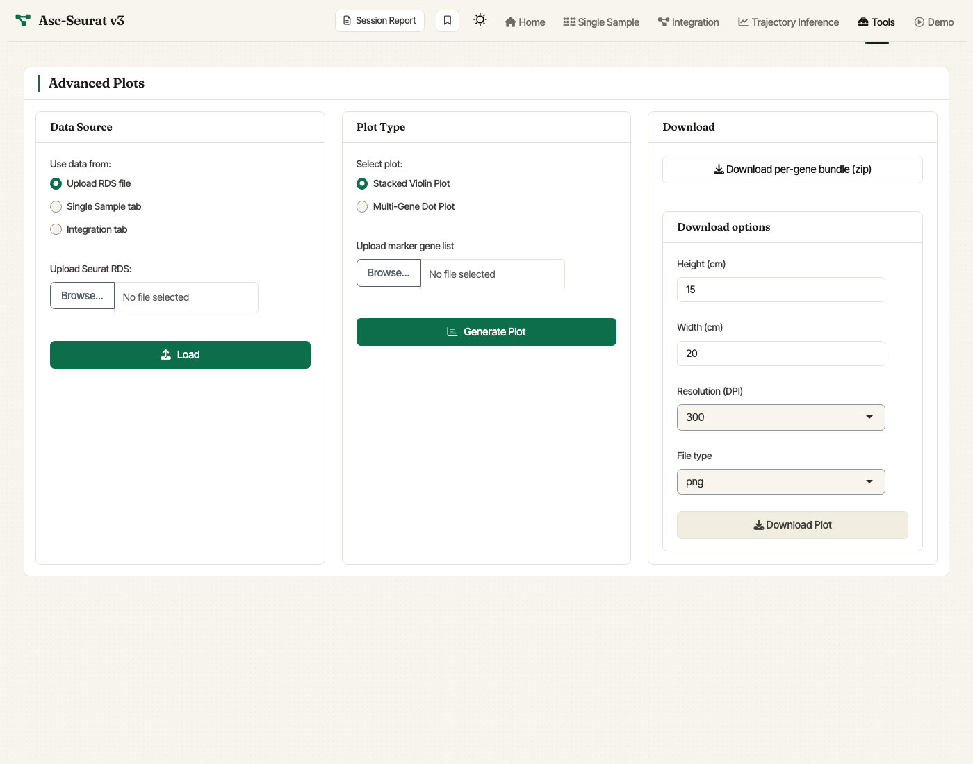
Advanced Plots tab. Choose the data source, upload a gene list, pick stacked violin or multi-gene dot plot, and configure download settings.
The expression visualization tools (single sample, integrated) focus on the standard Step 6 / Step 4 workflow. The Advanced Plots tab complements those modules by plotting many marker genes in one stacked violin plot or one multi-gene dot plot.
Gene list format
Upload a CSV or TSV marker-gene file. The first column should contain gene IDs. A second column is optional and can be used as a grouping variable when organizing the gene list. The tool keeps only genes that are present in the selected Seurat object.
Use Genes to plot to include all matching genes or only the first
N genes from the uploaded file. After the first plot is generated,
the ordering panel lets you adjust the display order of genes and
clusters before regenerating the plot.
Stacked violin plot
Stacked violin plots show the distribution of expression for several
genes across clusters in a compact vertical layout. Asc-Seurat builds
this plot with scCustomize::Stacked_VlnPlot.
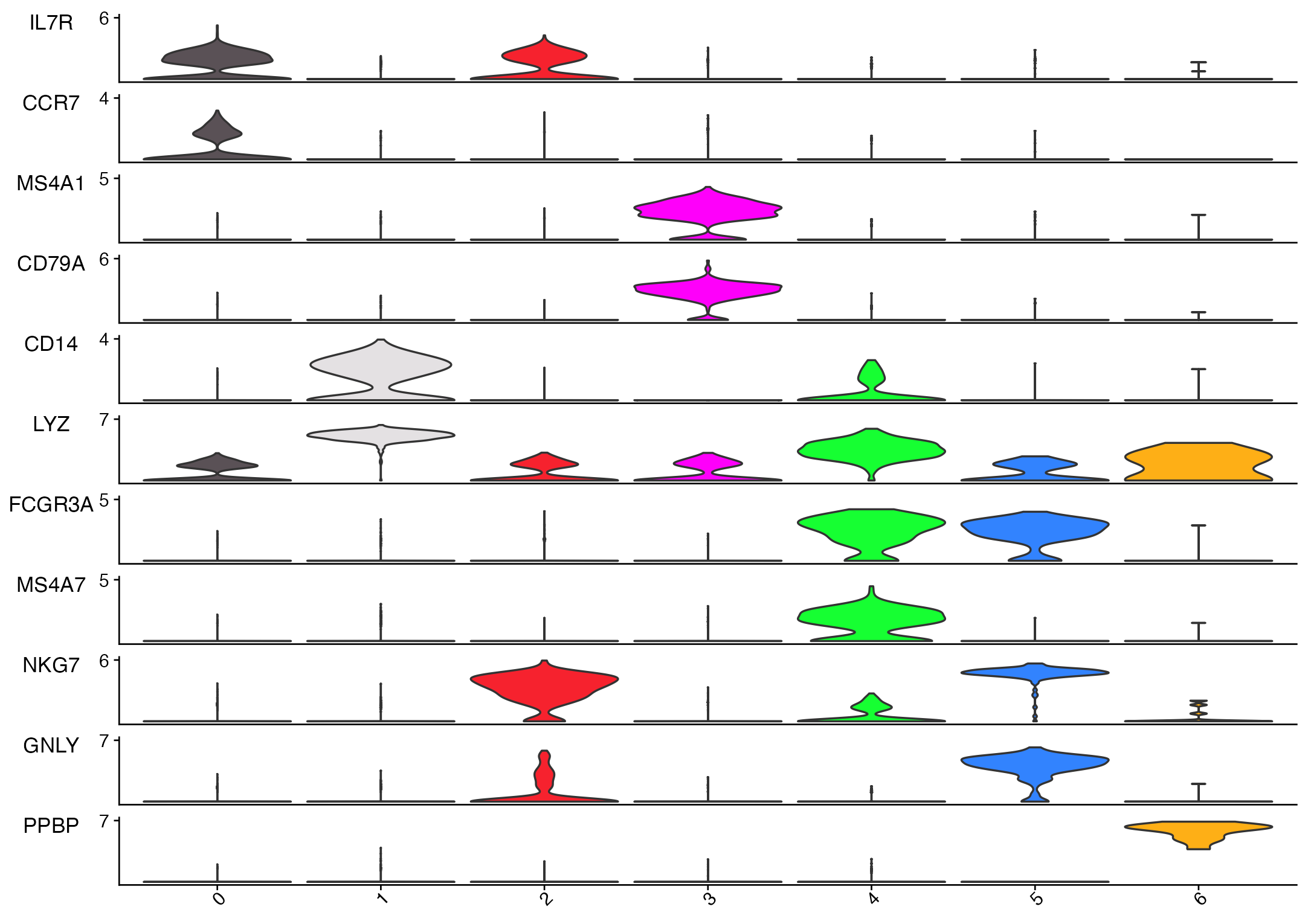
Stacked violin plot generated from the Asc-Seurat v3 demo clustered PBMC object using common marker genes.
Multi-gene dot plot
The multi-gene dot plot summarizes the same gene set by average
expression and the percentage of cells expressing each gene in each
cluster. Asc-Seurat builds this plot with
scCustomize::DotPlot_scCustom.
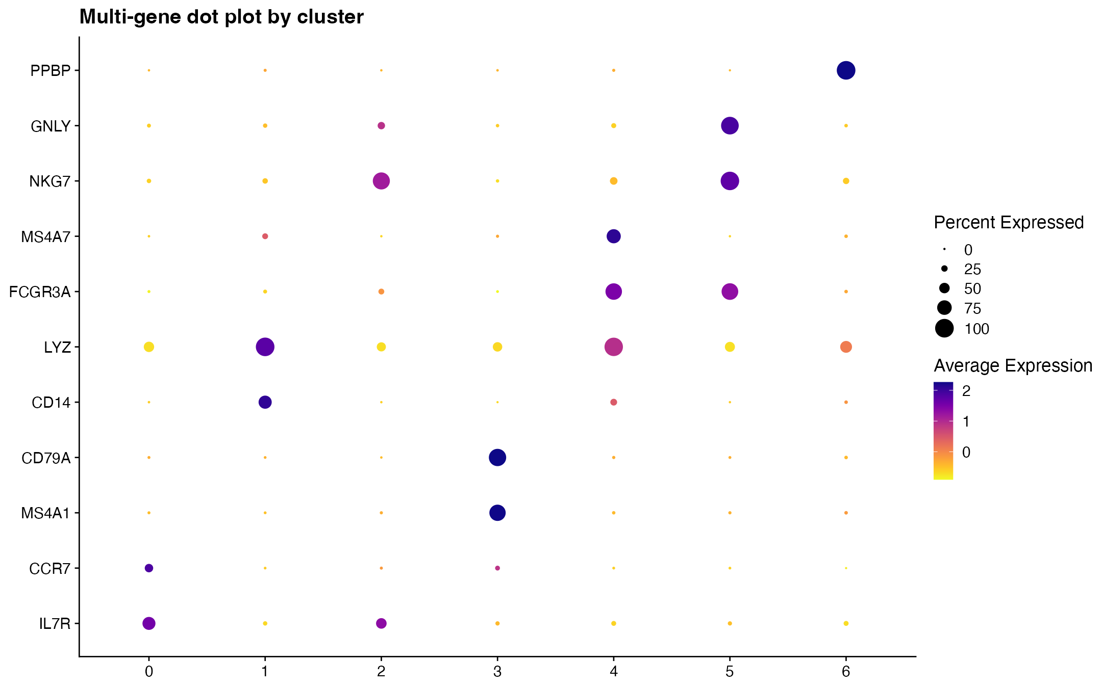
Multi-gene dot plot generated from the same marker list and demo clustered PBMC object.